WHAT IT'S ABOUT
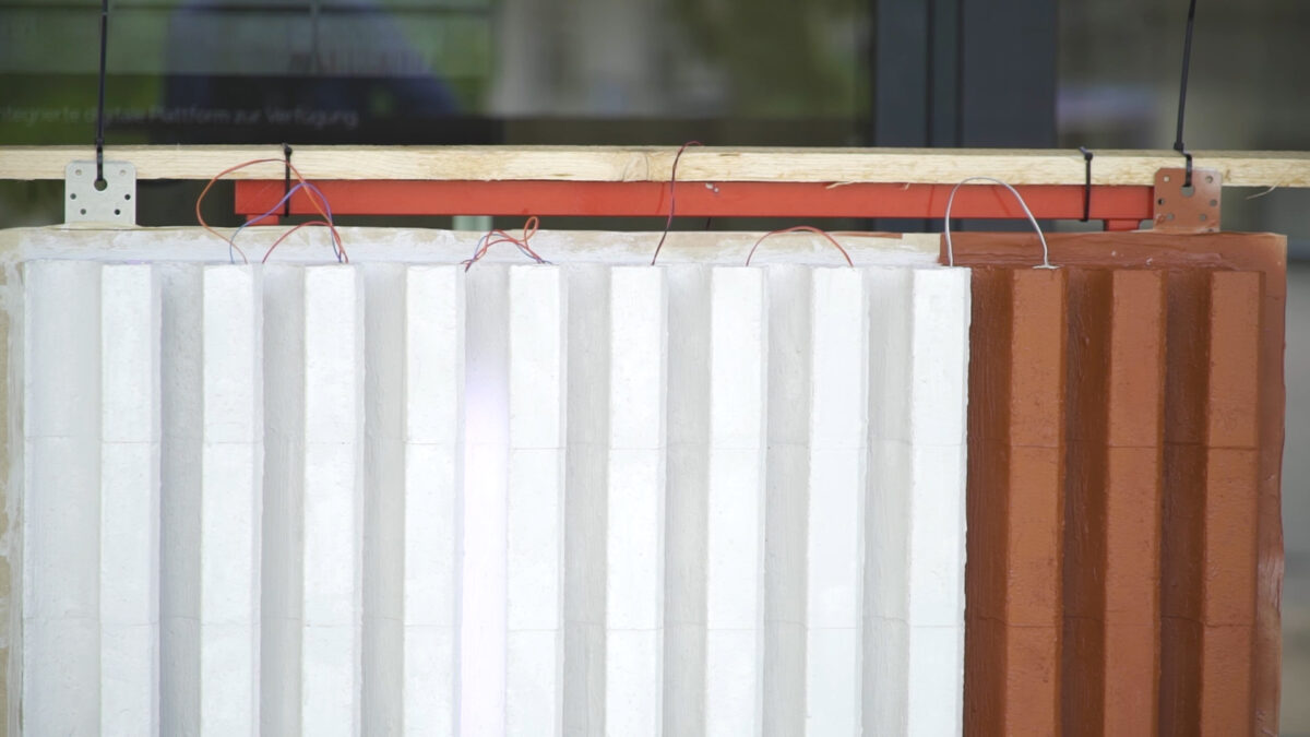
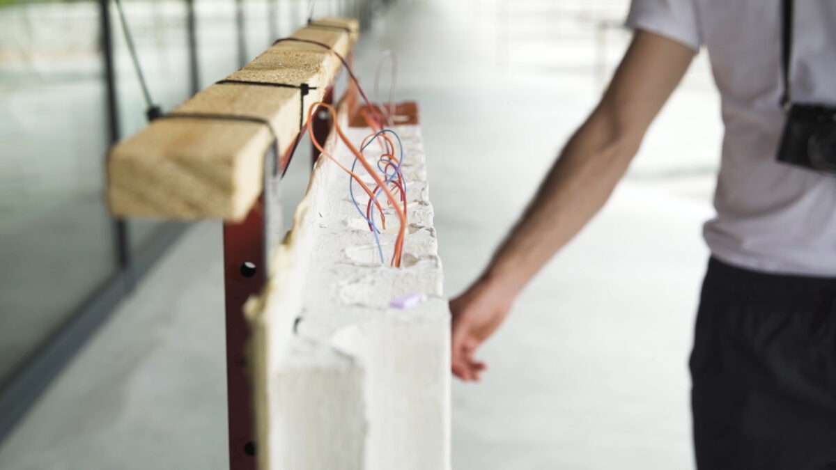
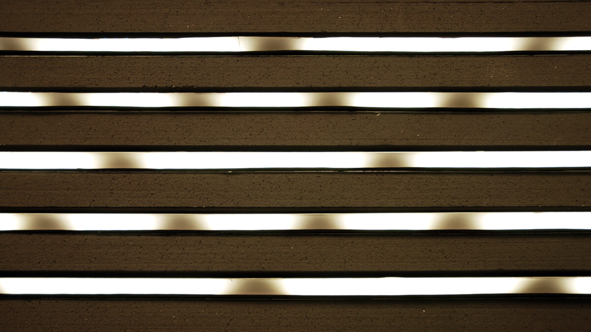
We are innovating new facades: engaging a combination of digital media and conventional construction materials, and thus, dissolving the historic rivalry between illuminated signage and building structures. This is demonstrated in particular by the jointed facades. Here, visual space is created within the facade, rather than superficially imposed. The follow up to our pioneering light frieze for the Kunstmuseum Basel, is an investigation of new forms. Through ongoing experimentation, we glean insight into the history of media facades and their mechanisms.
THE STARTING POINT: ART MUSEUM BASEL
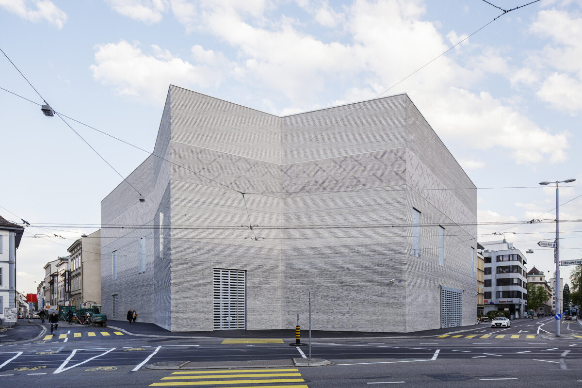
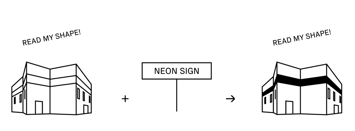
The urban structure that surrounds the Basel Museum of Art is the product of many centuries, and as such, mediates between the demands of pedestrians and motorists. The light frieze on its façade does the same. It is large enough for motorists to grasp, while remaining an integral part of a building whose specific form allows for a typological reading of the city in the traditional sense. The light frieze is not a neon sign propped up in the front of the building—without connection or correspondence to its aesthetics. Rather, its stylistic reduction, and like the hermeticism of the building, can be read as a gesture of refusal towards the oversaturated affect of commercial culture.
The light frieze of the Kunstmuseum Basel and its direct successors, which are currently under development, thus disrupt the historical oppositions of modernism and post-modern arbitrariness. They aspect the legacy of classical architecture, while also uninhibitedly expanding upon it.


HISTORICAL CONTEXT
The question of the effect and significance of media façades can be traced back to the architectural theory debates of the 1960s and 1970s. Historically, they are part of a car-oriented architecture that can be read and deciphered even from afar. In this sense, the illuminated panels of the Las Vegas Strip are the early manifestations of media architecture. Modernist thfeorists took a firm stand against such a city, which - formulated bluntly with Robert Venturi - consisted of sheds with large stick-on signs. In contrast to this, Robert Venturi and Denise Scott Brown developed a theory of the city based on Charles Moore's writings, which did not focus on the forms of the buildings and their arrangement in relation to each other, but rather emphasized other means of orientation such as signs or illuminated panels. This enabled them to take a positive view of suburban spaces without density and spatial structures that promote orientation. Venturi and Scott Brown focused their attention on the perception of the city from the car. Instead of being primarily a structured urban fabric, to the moving gaze of the driver the city appears as a sequential image. In the contemporary city, orientation in the spatial and social sense is no longer created by a specific structure, but by an image composed of lights and letters.
MAGICAL SHIFT
In media facades nodes of fascination develop precisely around obscurity: when it is unclear as to whether it is pure light play or the transmission of a message. Do we see mere ornament, or a configuration of signs? Is this trivia or a trick of shadow and light? Is this word, is this image — or both?
HOW WE CONTINUE OUR RESEARCH
For new projects - such as the Harvard Square Theatre in Boston - we are developing the principle of the light frieze on a technical level as well. One question is particularly important for the actual design: what sort of urban structure are we inhabiting? This one central question bifurcates: Do we need contrasting concepts for close-up or distant vision? Or do we even need double solutions for both? What is perceived by people standing still, walking, or riding past the building in their cars? At what angles do they see the façade? How bright should it be? How subtle? What are the various lighting conditions that cause the façade’s different effects?
EASY TO USE CONTENT MANAGEMENT SYSTEMS
The subtle interplay of natural and artificial light is deceptively simple, and this ease disguises the presence of controlling LEDs. The area of the light frieze wraps around three-quarters of the museum exterior, and can be used like any other video container: With fixed or moving light patterns in pixels that can have any brightness value from white to black. This makes the façade a relatively user-friendly medium with which curators, artists, and marketing strategists can develop their specific concepts.
WHAT IS INTELLIGENT CONTENT?
Often the primary concern is to position oneself optimally in the economy of attention. However, this does not require “volume”, or demand that buildings become advertising billboards. The strongest concepts are usually characterized by partial refusal: They can do what they do so well because they do not try everything. This denial is accompanied by questions that go beyond design in the narrow sense: How do you successfully provoke a sense of community and debate within your audience? And how can we transform technological solutions into models of sustainability that work in concrete social and ecological terms?
FACADE AS A TEMPORARY WORK OF ART?
All too often, a media façade is confused with an information screen. How, on the other hand, can the building structure and visual appearance be mutually reinforced? What seems to be of central importance is to include lighting conditions, materiality, and structure of the façade in the consideration of the content. In this way, those moments of fascination arise in which it is uncertain whether the phenomena is the effect of chance conditions or artistic intent. This would be a starting point for curators, artists and marketing strategists.
 News23.04.2025
Commitment to More Sustainability: We Are a New Member of Swiss Triple Impact (Sti)
→ Read on News27.01.2025
Catacity – the City Is Being Redesigned!
→ Read on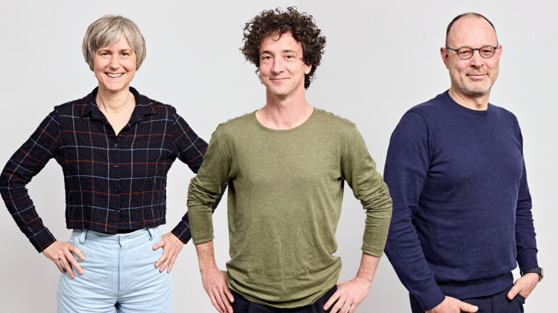 News06.01.2025
Three Experienced Minds for Your Success
→ Read on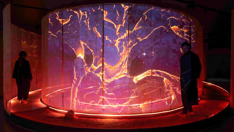 News18.12.2024
The ‘Inner Power’ Installation for Hyundai Genesis Magma Opens in Zurich
→ Read on News17.12.2024
Our Studio Will Stay Closed Between Christmas and New Year
→ Read on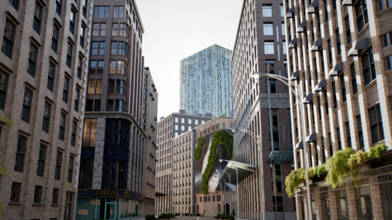 News26.11.2024
Next Generation Intelligent Skins
→ Read on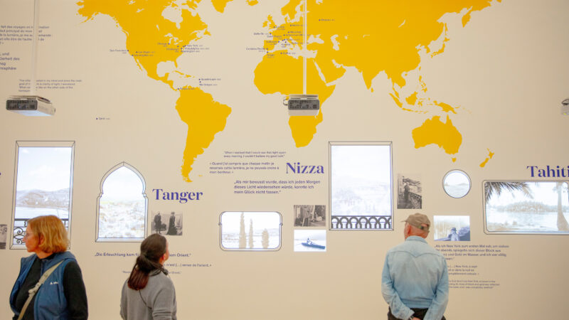 News30.09.2024
Matisse Exhibition at the Fondation Beyeler Opens with Multimedia Space
→ Read on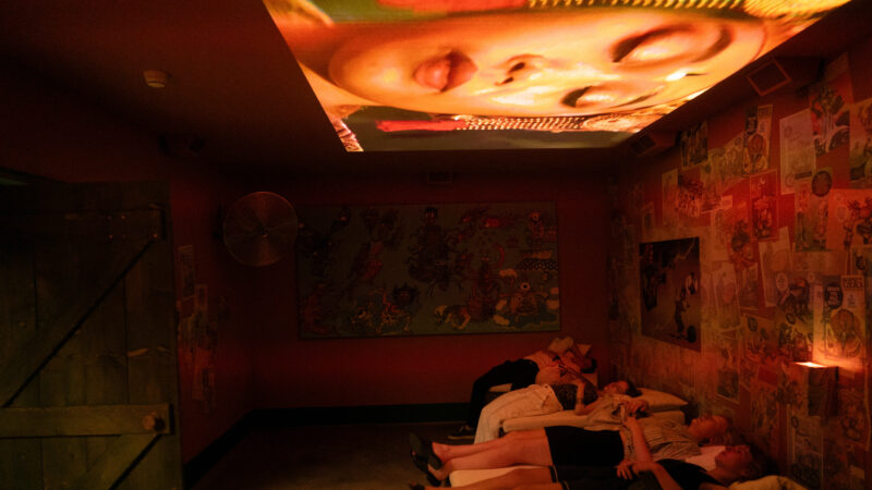 News30.09.2024
Roots Exhibition Opens at KBH.G
→ Read on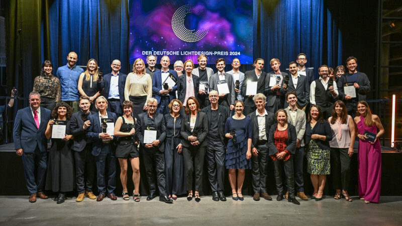 News10.06.2024
German Lighting Design Award for “Wonders of Medicine”
→ Read on News27.05.2024
Valentin Spiess Speaks at TEDxBasel
→ Read on News16.05.2024
Opening of the ‘The End of Aging’ Show at KBH.G Basel!
→ Read on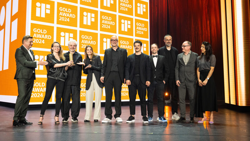 News07.05.2024
iF Gold Award for “Wonders of Medicine”
→ Read on